
Here are my blocks for a low-volume baby quilt in a blue-yellow-white colorway. There isn’t really as much contrast as the photo shows, but the medium blue does stand out.
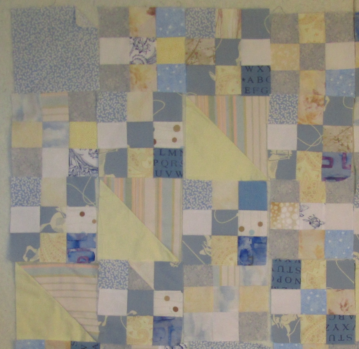
This is SO much lighter and calmer than my usual pallette that I thought it was low volume, but I don’t think I’m there. I felt I had to have some contrast for interest. I’m going to try again on a different quilt, but I so like this one, so I’m keeping it.
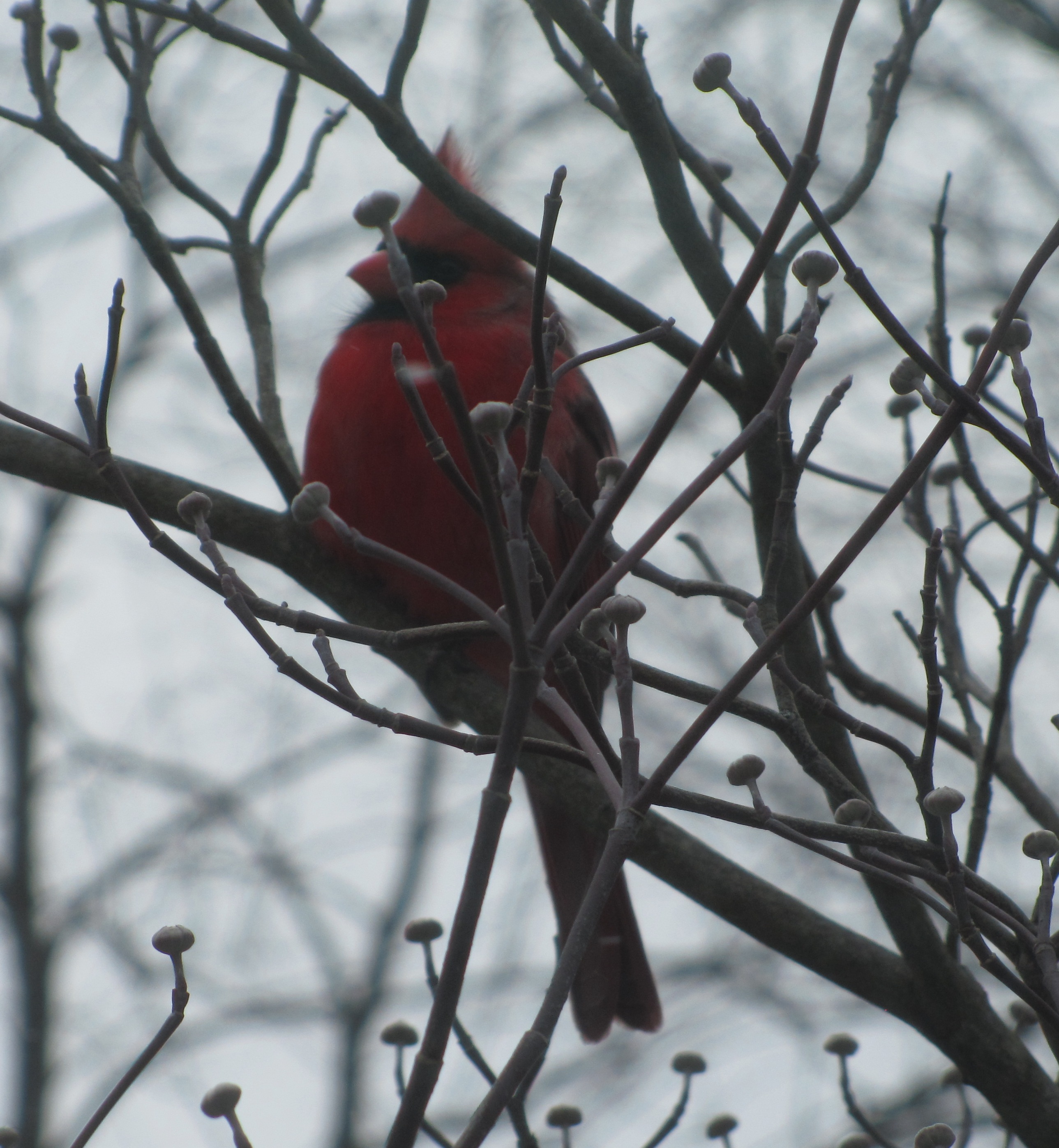
Spring is coming. This handsome bird came and sang for a long time in the dogwood outside my studio window yesterday.
Linking up with Design Wall Monday on Patchwork Times.

February 18, 2013 at 3:47 PM
I like it,the word soothing comes to mind
February 18, 2013 at 5:58 PM
For me, the word subdued comes to mind. I understand why you would call it low volume. But it’s interesting how photos can really let you see what others see.
February 18, 2013 at 8:12 PM
I think low volume quilts are really pretty… but I would have a hard time sticking to that palette. It seems you need some really striking light prints to make it work, I’d be afraid of ending up with a bland boring quilt. I like the look of yours and it is perfect for a baby quilt!